
project details
Building Intentions Set
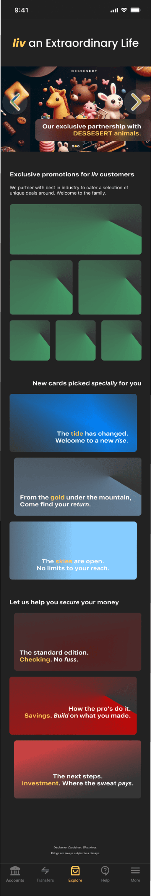
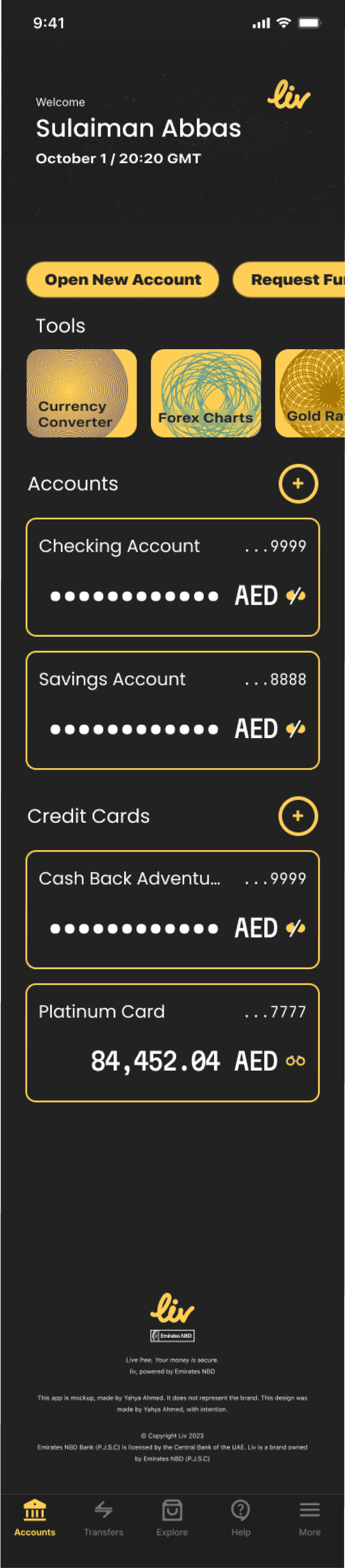
Photo. A snippet of the liv Bank project showcasing some highlights, including the primary accounts tab.
[
Project
]
liv Bank
[
Date
]
2023
[
Skills
]
Research, user persona, user flow, design system, component library, AI image generation, wireframing, UI design, copywriting, animation, prototyping, rebranding
Banking has evolved and left behind the age of weighty paper for a seamless flow of electric transactions. For the user to keep pace they require a trusted and secured mobile banking platform. liv Bank has envisioned this leap for its middle eastern market and is readapting its trusted establishment under a new brand.
They are now iterating their mobile banking application. It stands in the App Store with a 3.8 rating, with ~25% of those ratings being 1 star. They risk user retention in a competitive market.
As the FinTech industry evolves, banks must provide security and accessibility that adapts to intuitive designs to succeed. The user is hungry for a new banking experience to manage their money.
All designs, including verbiage, copy, drawings, are my own. Artificial Intelligence was used in this project for generating photos of the user persona and advertising carousal.
User research
Learning the User
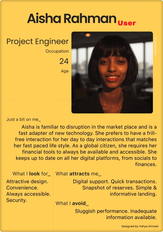
Photo. User persona featuring Aisha Rahman for the liv Bank project.
To identify the users for this project I generated numerous User Personas. One is detailed here.
Banking users have strict requirements. Take Aisha Rahman (Age 24 / Project Engineer). She is a global citizen familiar to new technology. Her key interests in mobile banking are trusted security, constant accessibility, convenience, and an unobtrusive-friendly design. Her largest concern is inadequate information available digitally resulting in slow downs while attempting to connect with live support.
User flow
Going Where the User Navigates
Diagram 1. Onboarding Flow
Welcome
Splash Screen
User login
Login confirmation
Accounts overview
Key user screens were defined early to identify where their priorities lie. First, an onboarding flow for first time app users was designed to excite users for their upcoming experience. Like an enchanting beginning to a film, users are welcomed to ease their transition.
The second key flow was designed for primary navigation. The objective was to establish a robust design system that is easily scalable, rather than a start to finish design. For this, an extensive prototype was designed to be able to immerse the experience in user testing.
In my research, users previously felt confused in understanding flow and constantly felt lost in navigating the app. I made key choices to provide a more intuitive design system, increased space, more simple help center for users, subtle animations, and color guides to make users flow more easily.
Diagram 1. Primary Flow
Tab: Accounts overview
Account details
Payments due, transactions, statements, budgeting
Tab: Shopping
Offers, points, new accounts
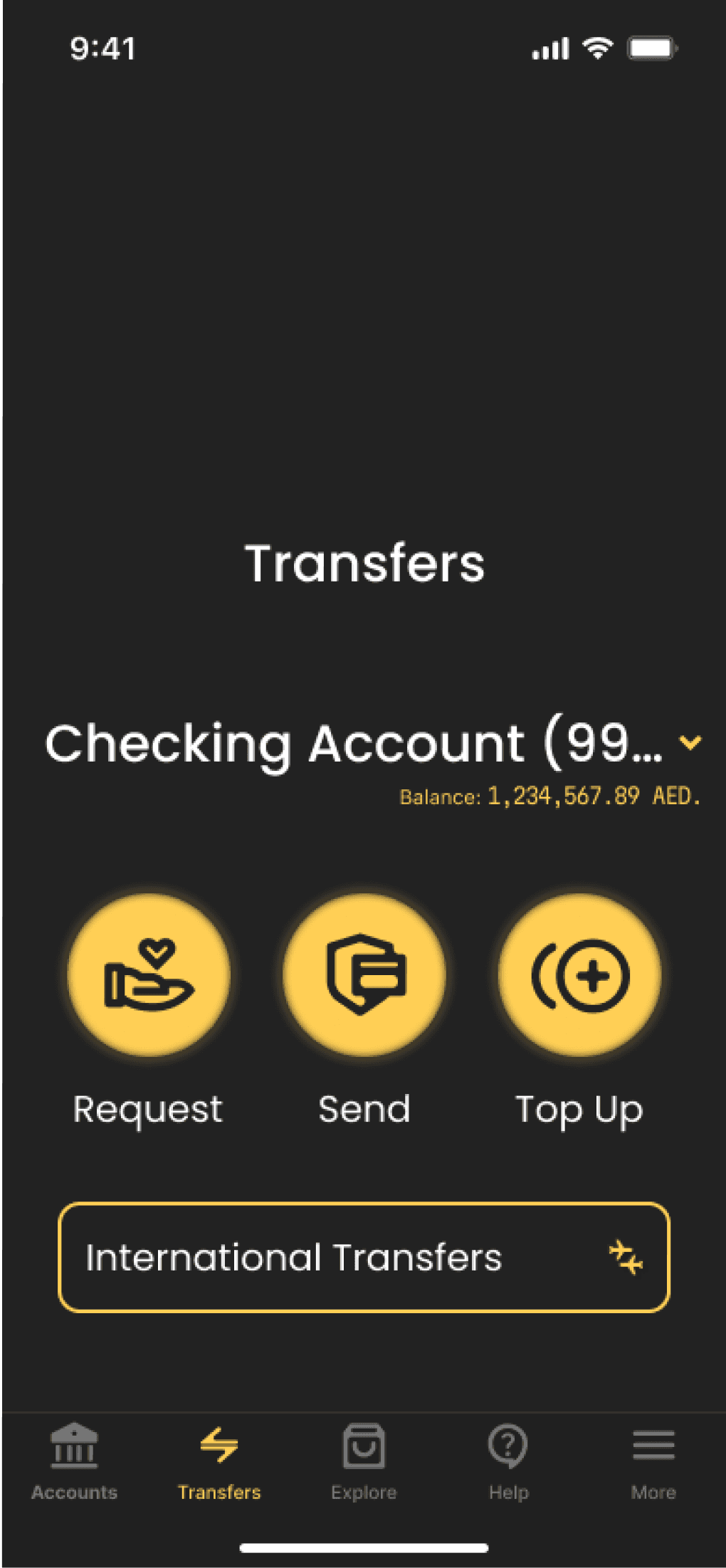
Tab: Transfers
International / Domestic, Bills
Tab: Frequently asked questions
Tab: Settings
App configuration, Accounts management
Key design choices
Focus on the User
Privacy & Security
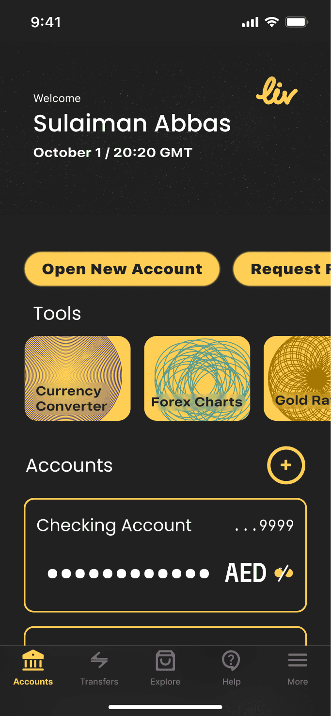
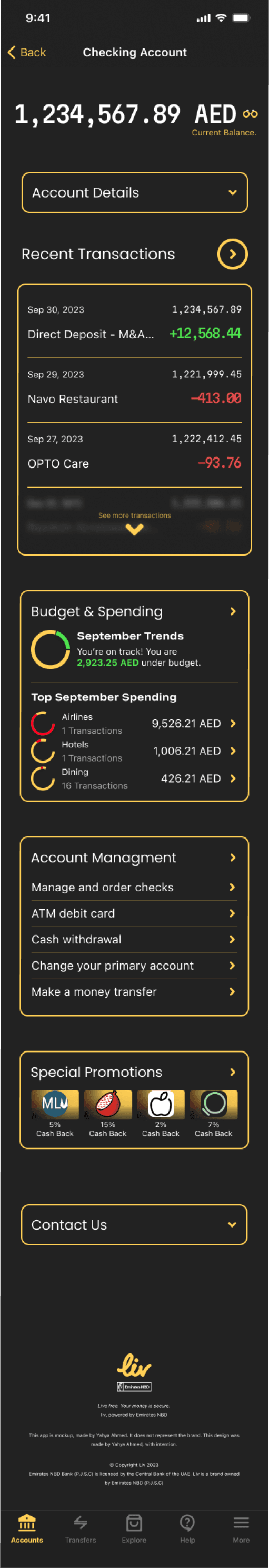
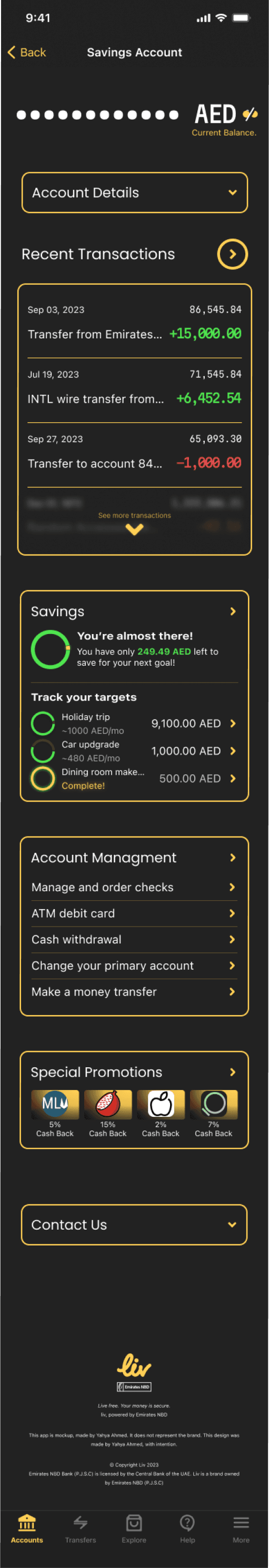
Photo. Privacy Shade. Displayed is the main Accounts tab. [Left] The privacy shade is enabled by default hiding the total holdings in the user account. [Right] The user can disable privacy shades at command.
liv Bank has been redesigned to be intentionally driven in providing ease in usability for it users while delivering key traditional banking concepts like privacy and security. Privacy shades are both fresh in their design while giving users the ability to fine tune their level of privacy at any moment. Our money should always be accessible, regardless of who's peeking over.
Accessible Touch Points
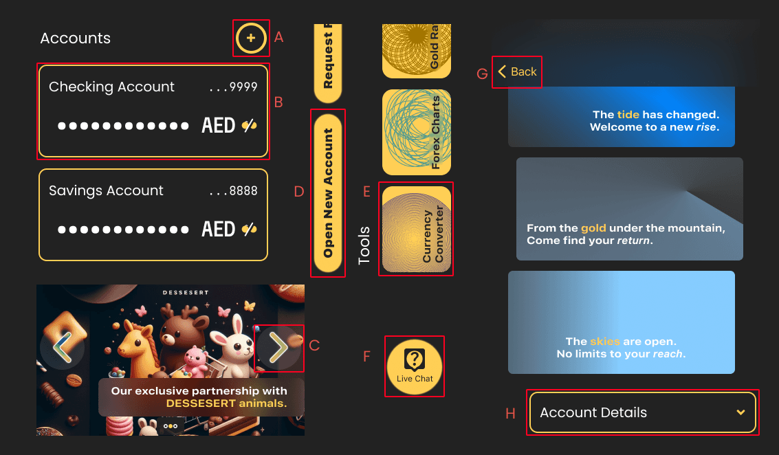
Photo. Touch Points. A: Add accounts button. B: Account details trigger. C: Next photo in carousal rotation. D: Quick actions buttons. E: Quick tools buttons. F: Customer service live chat button button. G: Back trigger, inline with the default iOS design system. H: Expanding tile.
Apple's Human Design Interface manual encourages the use of a minimum square length for key touch points at 45 pixels each side. Enabling a universally accessible design, I strove to maintain many such guidance, thus all key buttons and touch triggers have maintained the minimum of 45px. Some such key buttons are highlighted here.
Extensive Component Library
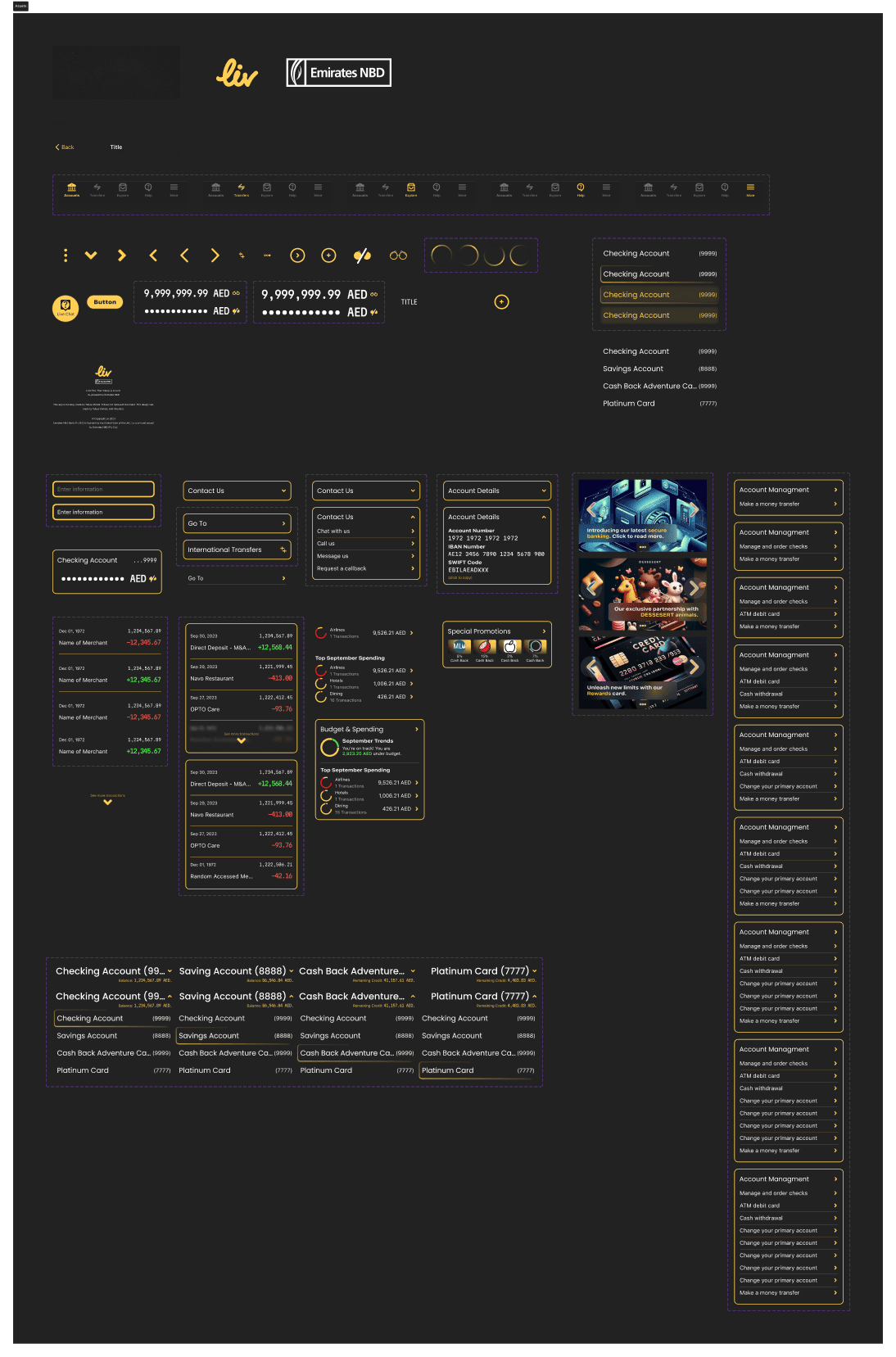
Photo. Components. Showcases many of the different components used throughout the project providing a clear design language and a set of building project for future expansion of the design.
The project is designed to be quickly scalable to extensive limits. Banking apps have a versatility in functionality as they are continuing to expand their capability. As eCommerce, investments, borrowing all headed to the digital realm in disrupting ways, modern banks must be ready to adopt new technology and new opportunities for their companies. Components serve as building blocks. Their standardization allows for a language to be defined throughout the design.
Each component is intentionally designed to ensure that it provide clarity and versatility in use cases. Some are littered with customization for the designer, others simple to ensure continuity - different solutions to different problems. Together they all become a cohesive product that functions smoothly for the user feeling natural and native to their intuition and OS.
Design System / liv bank
text styles
Large Title
Poppins
weight600
34pt
Title 1
Poppins
weight500
28pt
Title 2
Poppins
weight400
22pt
Title 3
Poppins
weight400
20pt
Hex #FFCF55
Primary
Hex #222222
Neutral
Hex #FFFFFF
Neutral
Hex #FE0121
Accent
color styles
Want more details of my projects? Find me below.
Project Showcase
liv Bank
mobile Banking

Pomo Climb
Time tracking
Play
dance collection
On Going Projects
girojisdj girojisaf
gamified tech for parenting
Thank you for your time.
All designs in this document are owned by Yahya Ahmed. Any logos, or other intellectual properties belong to their respective owners.
Globally Available
All rights: 2024 Yahya Ahmed.
Designer, Creator, Builder.